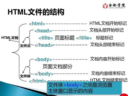
.birthday .container{
width:600px;
height:600px;
margin:0px auto;
background: #fafafa;
border-radius:5px;
position: relative;
}
/**
** 顶层的
**/
.birthday .top-one{
position: absolute;
width:280px;
height: 280px;
bottom: 200px;
left:160px;
}
.birthday .top-one .bottom{
position: absolute;
width:280px;
height: 280px;
bottom:-30px;
border:1px solid #3e2001;
border-radius: 140px;
transform: rotateX(60deg);
z-index: 4;
background: #3e2001;
box-shadow: 0px 0px 20px #3e2001;
}
.birthday .top-one .top{
position: absolute;
width:280px;
height: 280px;
top:-50px;
border-radius: 140px;
background: #FFFFFF;
transform: rotateX(60deg);
box-shadow: 2px 2px 20px #b7b7b7;
z-index: 6;
background: -webkit-repeating-radial-gradient(circle, #783d01, #3e2001 10px, #914909 10px,white 20px);
background: -moz-repeating-radial-gradient(circle, #783d01, #3e2001 10px,#914909 10px,white 20px);
}
.birthday .top-one .side{
position: absolute;
top:95px;
width:280px;
height: 70px;
border:1px solid #3e2001;
border-top-width: 0px;
border-bottom-width: 0px;
background: #FFFFFF;
z-index: 5;
background: #3e2001;
}
/**
** 底层的
**/
.birthday .bottom-one{
position: absolute;
width:400px;
height: 400px;
bottom: 0px;
left:100px;
}
.birthday .bottom-one .bottom{
position: absolute;
width:400px;
height: 400px;
bottom:-30px;
border:1px solid #914909;
border-radius: 200px;
transform: rotateX(60deg);
box-shadow: 2px 2px 20px #914909;
z-index: 1;
background: #3e2001;
overflow: hidden;
}
.birthday .bottom-one .line{
position: absolute;
width:400px;
height: 400px;
border-radius: 200px;
z-index: 1;
}
.birthday .bottom-one .line1{
bottom: 30px;
border:5px solid #783d01;
left:-5px;
z-index: 1;
}
.birthday .bottom-one .top{
position: absolute;
width:400px;
height: 400px;
top:-100px;
border:1px solid #3e2001;
border-radius: 200px;
background: #FFFFFF;
transform: rotateX(60deg);
z-index: 3;
background: #783d01;
box-shadow: inset 0px 0px 20px #3e2001;
}
.birthday .bottom-one .side{
position: absolute;
top:100px;
width:400px;
height: 130px;
border:1px solid #3e2001;
border-top-width: 0px;
border-bottom-width: 0px;
background: #3e2001;
z-index: 2;
}
/**
** 底层的文字
**/
.birthday .flower{
position: relative;
text-align: justify;
z-index: 9;
top:200px;
font-size: 32px;
font-family: "Helvetica Neue", "Noto Sans CJK SC", "Source Han Sans CN";
color:#FFFFFF;
font-weight: bold;
}
.birthday .flower:after{
content:"";
display:inline-block;
position: relative;
width:100%;
}
.birthday .flower i{
position: relative;
width:80px;
line-height: 80px;
display: inline-block;
border-radius: 50%;
border:2px solid #783d01;
text-align: center;
}
/**
** 顶层的文字
**/
.birthday .top-one .text{
width:100%;
text-align: center;
position: absolute;
top:165px;
z-index: 9;
margin:0px auto;
font-size: 30px;
color:#FFFFFF;
transform: rotateX(60deg) skew(10deg,20deg);
}
/**
** 蜡烛
**/
.birthday .candle{
width:10px;
height:80px;
margin:0px auto;
position: absolute;
left:295px;
top:130px;
z-index: 9;
}
.birthday .candle .body{
width:10px;
height:70px;
margin:0px auto;
background: red;
border-bottom-width: 0px;
}
.birthday .candle .top{
width:10px;
height: 10px;
border-radius: 5px;
transform: rotateX(60deg);
position: relative;
top:5px;
background: red;
}
.birthday .candle .bottom{
width:10px;
height: 10px;
border-radius: 5px;
transform: rotateX(60deg);
position: relative;
bottom:5px;
background: red;
box-shadow: 1px 1px 10px red;
}
.birthday .candle .fire{
position: absolute;
width:6px;
height: 6px;
left:2px;
transform: rotate(45deg);
background: #ffd507;
box-shadow: 0px 0px 20px #ffff00, 2px 2px 10px red;
}
Happy Birthday
生
日
快
乐
更多推荐
用html写出生日蛋糕,纯HTML5+CSS3制作生日蛋糕代码


发布评论